US Maps of ACOs
Is the ACO industry growing?
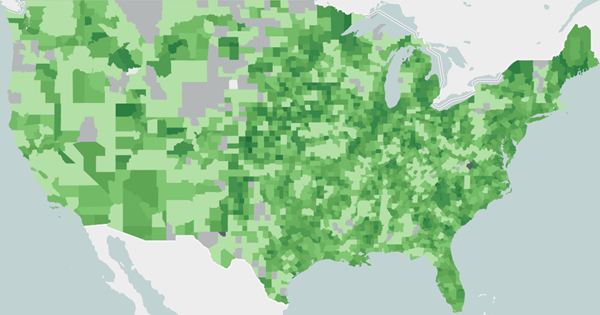
Yes! In the graphic below, the U.S. map shows the exposure of ACOs by counties in 2018. The darker green represent counties with a greater share of ACO-eligible beneficiaries assigned to an ACO. We encourage you to share the maps in your board and community presentations – ACOs are a strong, growing industry!


- Darker shades of green represent counties with a greater share of ACO-eligible beneficiaries assigned to an ACO.
- Dark gray shading represents counties with fewer than 11 ACO-eligible beneficiaries. Due to CMS cell-suppression rules, we are unable to provide exposure rates for these counties.
- Light gray shading represents counties with fewer than 11 ACO-attributed beneficiaries. Due to CMS cell-suppression rules, we are unable to provide exposure rates for these counties.
- The lightest gray shading represents the counties that were not present in the CMS MSSP ACO Files.
|


